Swoon Reads Cover Drafts
When I worked at Macmillan Children's books I was helping to design covers and interiors for Swoon Reads, a new crowd sourcing YA romance imprint. You can read about the process of designing the interior of a book in the blog post I did for Swoon Reads: Pulling Back the Curtains: Interior Design. Now that I'm freelancing for them I thought I would take a minute to post some old cover comps I worked out while at Macmillan. Some of these appeared on the Swoon Reads website during the voting process, but none were chosen. However, I think the process of designing a book cover is an interesting one, and I wanted to share a little of what I had in my archives.
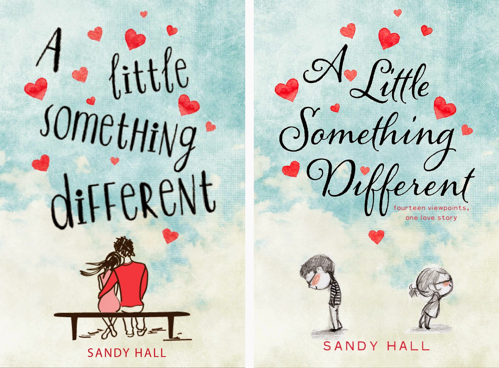
The first manuscript to be chosen and printed by Swoon Reads was A Little Something Different. I was experimenting with different fonts and images with this one. I loved the black and white pencil sketch of the boy and the girl (you can see the original art by Genevieve Santos here), but it was ultimately decided that they looked too young and were replaced with the older couple you see on the left.

I really enjoyed reading the manuscript for Love Fortunes and Other Disasters, and as a result had a number of ideas about the tone and feel of the cover. I wanted it to be fun and playful and show the idea of a town that believes in love while playing with the idea of the physical fortune that people receive.

For Velvet, I found a number of really atmospheric photos that inspired me to go for a look that would convey the mystery and fantasy I found in the manuscript. I especially loved the light in these images and I enjoyed choosing some elegant fonts to go with them.
The first manuscript to be chosen and printed by Swoon Reads was A Little Something Different. I was experimenting with different fonts and images with this one. I loved the black and white pencil sketch of the boy and the girl (you can see the original art by Genevieve Santos here), but it was ultimately decided that they looked too young and were replaced with the older couple you see on the left.
I really enjoyed reading the manuscript for Love Fortunes and Other Disasters, and as a result had a number of ideas about the tone and feel of the cover. I wanted it to be fun and playful and show the idea of a town that believes in love while playing with the idea of the physical fortune that people receive.
For Velvet, I found a number of really atmospheric photos that inspired me to go for a look that would convey the mystery and fantasy I found in the manuscript. I especially loved the light in these images and I enjoyed choosing some elegant fonts to go with them.
Comments
Post a Comment